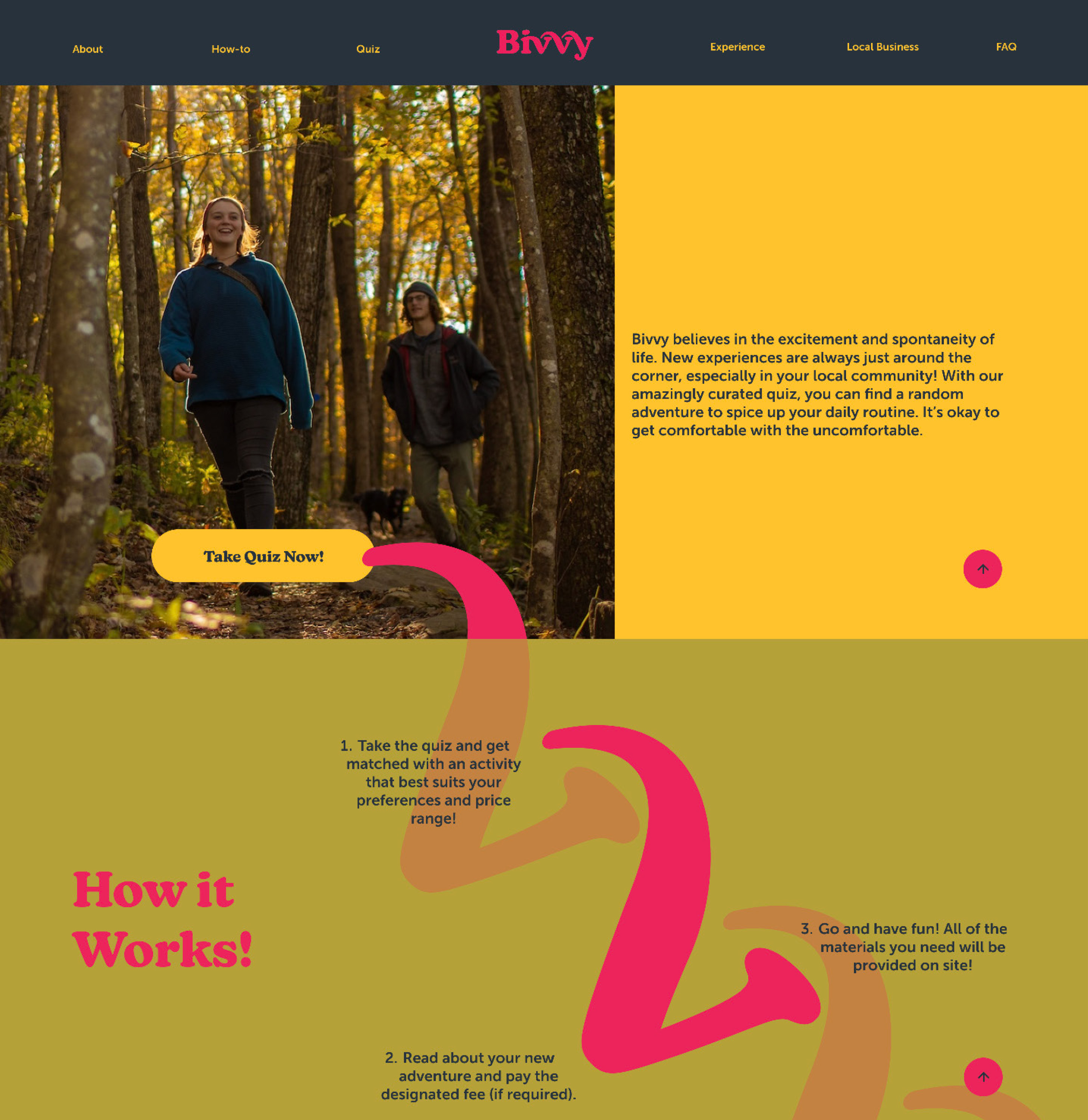
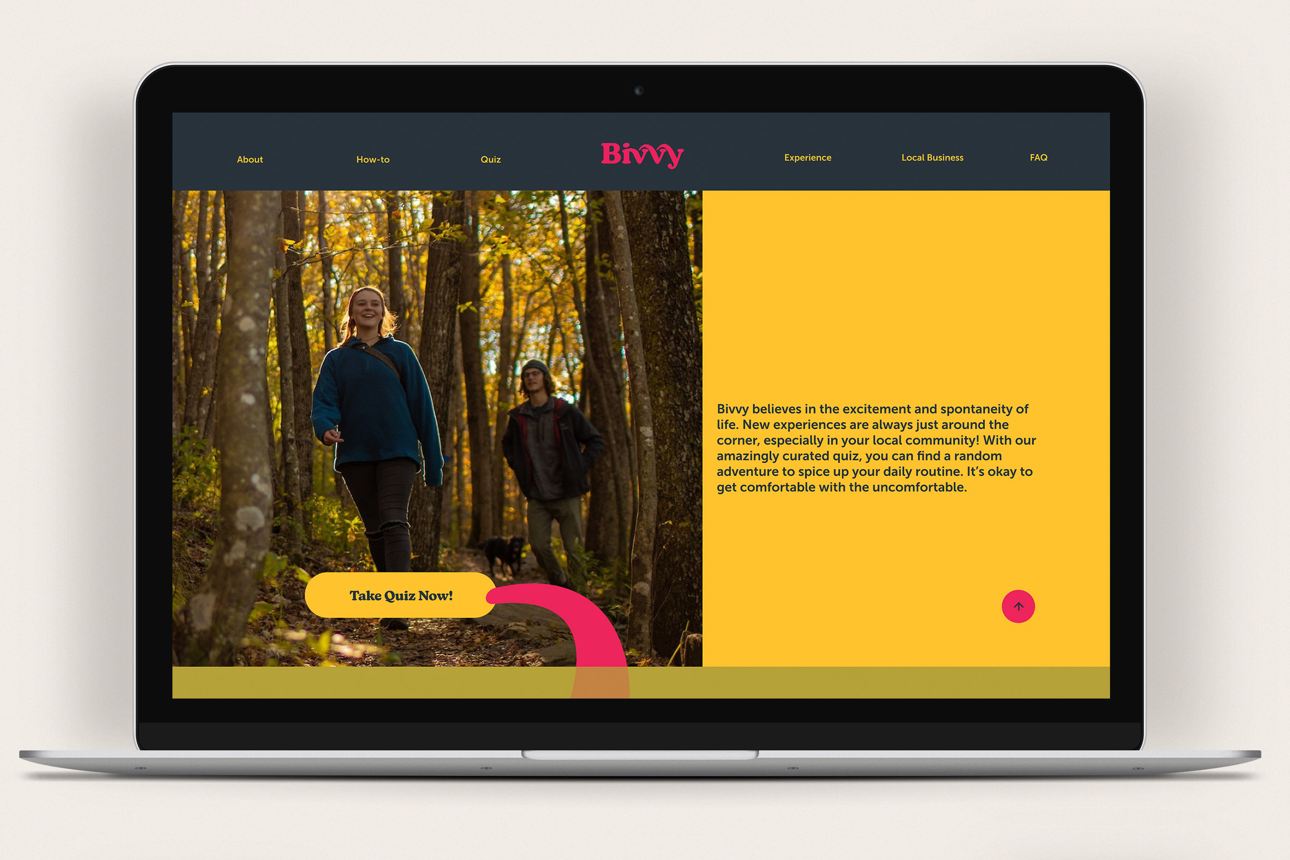
The client had many ideas when it came to the visual identity of this company. Our first challenge was narrowing down and simplifying these themes and values into cohesive brand stories.
The through lines for the brand were to steer away from corporate style design and to place importance on community, culture, and literature.
She wanted an outdoor feel similar to the nostalgia of summer camp, while not pigeonholing the brand too much. Although the activities center around the outdoors, it is not the only type of activity the website provides access to.
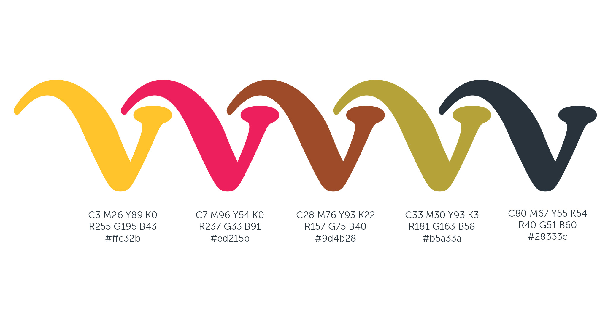
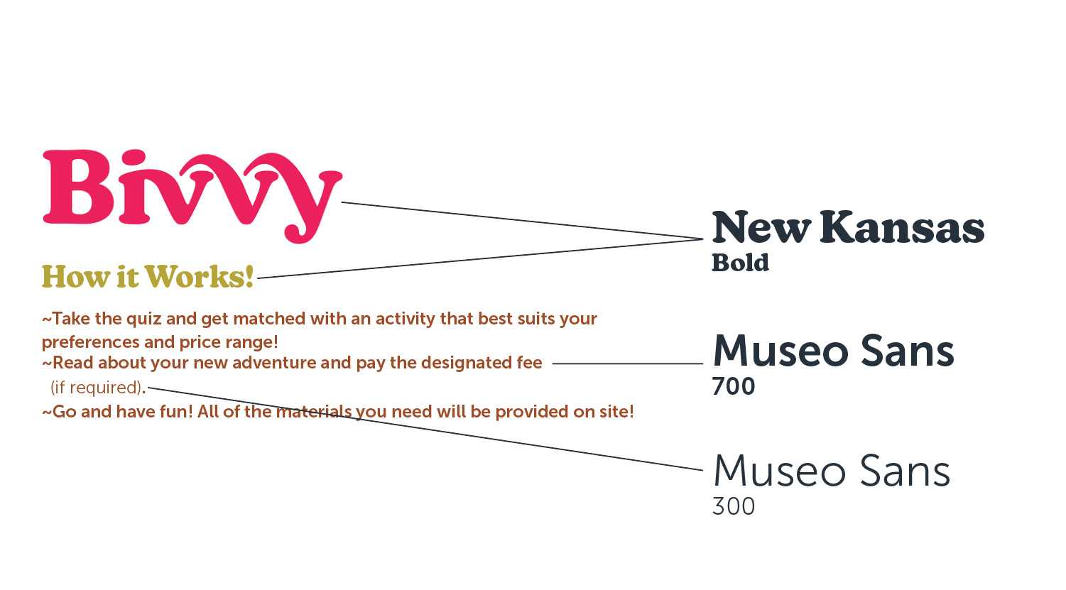
I ran with the summer camp aesthetic and developed a brighter color palette, expressing the excitement and activeness of Bivvy. When it came to typography, I gave a slight nod toward vintage camp and hiking guides, a notion mentioned by the client in our meeting.
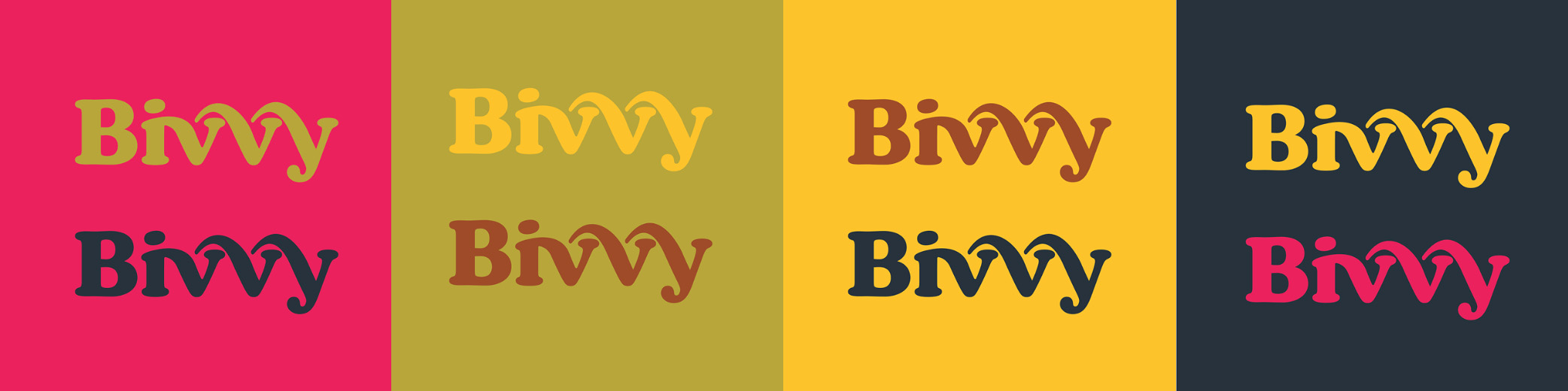
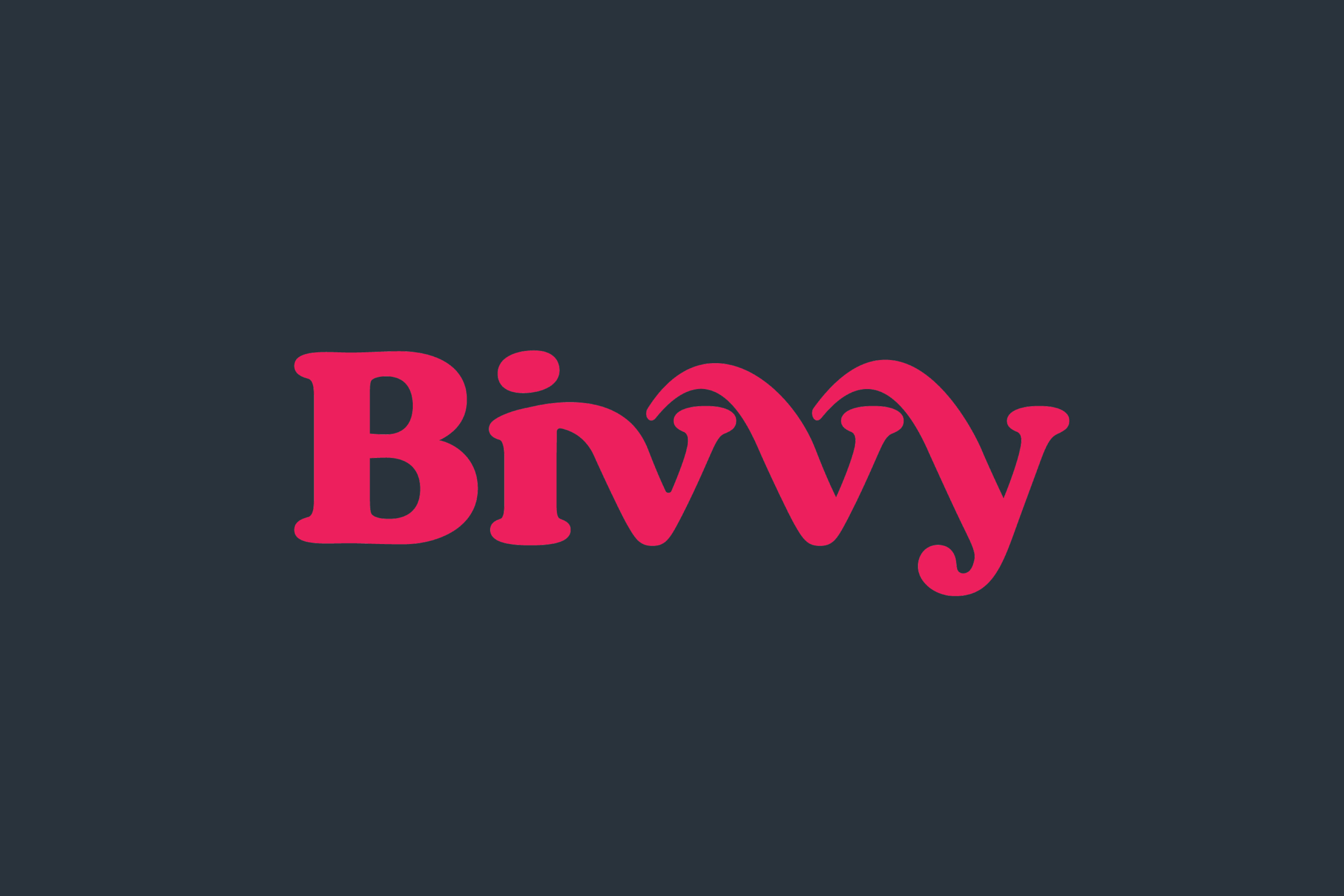
The
v
and
y
jump to interlock with the other letters, expressing activeness within the logo. That combined with the
iv
ligature responds to the way the resource connects and creates community as the individuals that use Bivvy explore their local area.
The call to action has a playful format, portraying inclusivity when it comes to who can use the website. I wanted to avoid seeming too high brow or monetarily inaccessible. Bivvy's vision allows for activities that vary in price range meaning anyone can be satisfied with the service.